
Mixing color.
A nightmare on Paint Street? Not necessarily.
Like all the topics we touch on in here, mixing color is a biggie. There are however, some simple strategies that you can develop to take some of the pain out of the process.

There are a lot of theories about color mixing. Some of them are very complicated, and are just a little bit too much like studying rather than playing. It seems to me to be easier to develop a theory around what works for you.
Some great advice is learn from people who push paint around, and not from people who talk about it. Find someone who’s work you admire and try and learn something from them.
In the meantime, here are seven practical processes that will help with mixing color while you’re in the heat of battle:
1. Start with a Big Palette. Line up your colors at the top of your palette to give you as much working space as possible. This will give you plenty of room to mix your colors without fear of contamination.

2. When mixing paler colors, start with white and add the pigments of your choice in tiny increments. This will stop you wasting 28L of white to get your color pale enough.
3. Keep your palette organised. Draw chalk lines down from the colors you’ve dished up at the top of your palette. For example, warm blues down the warm blue column, cool blues in the cool blue column. This is an especially useful strategy when painting gradations of color.
4. It makes life easier when mixing color if you have a cool and warm version of each primary color. For example, Pthalo Blue (cool blue) and French Ultramarine Blue (warm blue), and Alizarin (cool red) and Napthol Red Light (warm red), Cadmium Yellow Light (cool yellow) and Cadmium Yellow Medium (warm yellow). Click here if you’re just starting out.

5. Color warms as you get closer to the light source. For example, in a sunset you’ll find the yellows and reds closer to the light, and the purples and blues further away - the blues being the furthest.

6. Mixing cool colors together will give you bright, “cleaner” colors. Tropical water for example. Mixing warms with cools will give muddier, dirtier colors. Mixing the warms together will give you even more mud for your money.


7. Experiment with number 6. Develop a library of recipes for future reference. This will help you develop a series of “go-to” colors for particular circumstances/elements in your paintings. (Stay alert for nuances that will alter these in some way). **My downloadable Beachscapes Recipe Book is now available!

If you investigate the points above, you’ll find yourself well on your way to creating a magnificent masterpiece!
Back To Acrylic Painting Tutorials
Back to Explore Acrylic Painting Home Page

Search This Site:


WTH is Acrylics Anonymous?
For more great painting tips, subscriber only specials and zingin' humour (hmmm, maybe?), subscribe to our monthly e-zine, Acrylics Anonymous. It’s fast, free, and we don’t send you junk. As a valued subscriber, you can purchase our 3 pack of downloadable how to paint with Mark Waller DVDs for only $80, or our downloadable V-log “Coral Reef - Underneath” for only $12.
See your subscription confirmation email for more details.
Subscribe here:
Recent Articles
-
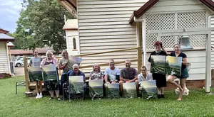
Workshops past. Been & gone. Delve into past notes, info and stories.
Apr 20, 26 07:27 PM
 Mark Waller's workshops past - discover what was learned about, talked about, laughed about and consumed with gusto!
 -
Upcoming Workshops with Mark Waller
Apr 06, 26 11:49 PM
 Upcoming workshops & tutorials in your local areas, check here!
 -
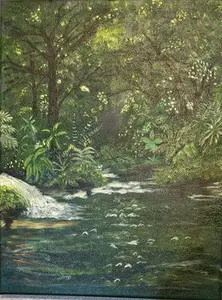
Mangrove of Costa Rica
Feb 09, 26 08:25 PM
 I often visit my sister in Costa Rica where she and her husband live. They have a vacation destination business. People come to stay at one of the homes

 Subscribe to this site!


![]()
About Us | Contact Us | Sitemap | Disclaimer | Privacy
Our Partners:
Copyright© 2007- All Rights Reserved