
- Home
- Painting Tutorials
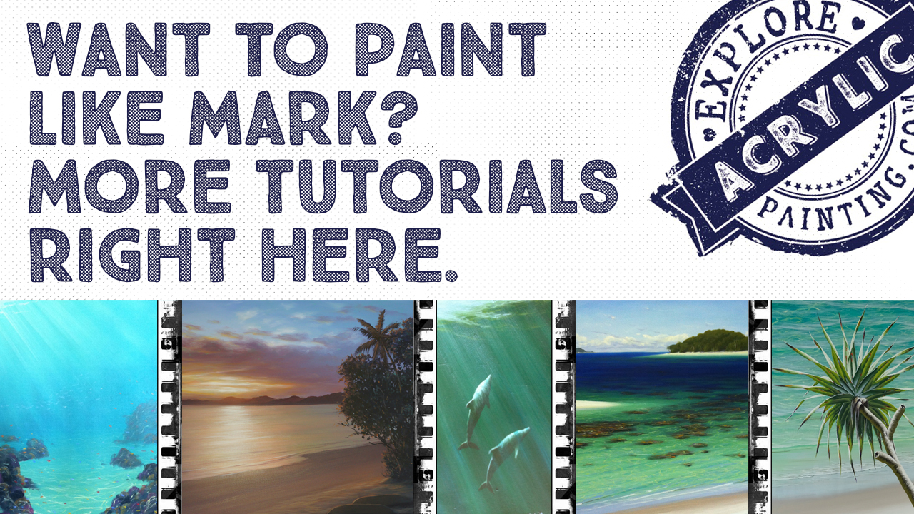
- Painting a Pebbly Beachscape
Painting a pebbly beachscape.
Simplify painting a shallow pebbly beachscape by painting the negative space.


WIN THIS ORIGINAL PAINTING
***COMPETITION ENDS 30TH NOVEMBER 2023***
Be in it to win it!
WIN this original Mark Waller painting - a pebbly beachscape!
💫💛🎉🌟✨💫💛🎉🌟
“Play”
Acrylic on canvas
600mm x 440mm
valued at $640.
🌅🏞🌄🌅🏞🌄🌅🏞🌄🌅🏞
What you need to do:
Watch our latest full tutorial on Youtube here.
Paint your version of Mark’s tutorial, upload to your Instagram account and tag us in it (@explore.acrylic.painting.com)
📬💌📩📬📩💌📩📬📬📩💌
💡💡💡💡💡💡💡💡💡💡💡
Competition ends 30th November 2023. One name will be drawn at random from the Instagram tags and announced via our Acrylics Anonymous ezine and our social media on the 1st December 20223.
(Make sure you're subscribed to our ezine Acrylics Anonymous).
Prize includes worldwide postage (painting sent unstretched and rolled in a tube), but does not include insurance. Does not include customs, VAT or any other duties. Competition is open to all ages.
This giveaway is not sponsored, endorsed, administered or associated with Youtube, Google, Instagram or Facebook.
💫🙌🎨😋🙌💫😋🎨🙌💫😋
Thank you all so much for your support!
Love from us here at Explore HQ,
Mark and Frankie 💫💛🎉
Now, back to our painting a pebbly beachscape tutorial! The idea of painting water and waves can sometimes be a bit intimidating. It can be hard to know where to start . So in this pebbly beachscape tutorial, it’s all about narrowing our attention in different directions to make it easier to break the process down.
This is a useful technique for any painting - this concept should expand your entire repertoire of painting waves and water.
Painting a pebbly beachscape is an awesome opportunity to discover how to inject realism into your waves and beachscapes with simple techniques.
This is a tutorial we did at a recent workshop in Woolgoolga, and then re-filmed the process and put it on Youtube. So you can just follow along with that process if you want! Or scroll along for the whole the written formula. Note that this written process was done in a slightly different way to the video ;) Sorry if that’s confusing!
First up, materials needed for this painting a pebbly beachscape tutorial:
What You Need:
Atelier Interactive Artists Acrylics:
- Titanium White
- Pthalo Blue
- French Ultramarine Blue
- Cadmium Yellow Medium
- Cadmium Yellow Light
- Dioxazine Purple
- Burnt Umber
- Permanent Alizarine
Canvas:
- 45cm x 61cm stretched canvas - portrait orientation
Brushes:
- 7cm across house painting brush
- smaller flat for later on
Extra:
- White (or blue) chalk
I use Artists quality acrylic paints by Chroma Australia, Atelier Interactive and Atelier Free Flow.
Here we go!
To paint the background for our pebbly beachscape, we’ll start by mixing a colour representing the sand colour. We’ll use Cadmium Yellow Medium, Dioxazine Purple and a pile of White. This is our sand colour. We’re going to start at the bottom and work our way up - upside down :D
Paint this colour in a band across your canvas using the small house painting brush.
Add White and French Ultramarine Blue to this colour and paint another band underneath the first, blending the colours together.
Add more White and French Ultramarine Blue to this colour along with a tiny bit of yellow. We’re adding the blue to create the impression of the sky being reflected on the surface, but there is still some yellow in there to represent the substrate.
Add French Ultramarine Blue and Cadmium Yellow Medium to this colour, using a smidge of water to help the paint move, and paint this in a band and blend upwards. You want a nice subtle gradation.
Add a bit more French Ultramarine Blue and Cadmium Yellow Medium and added one more strip across to blend. This is a combination of the water colour, the sky colour and the sand colour. But because it’s been quite shallow up until now, there hasn’t been a lot of water colour.
So now we’re going to add a bit of Pthalo Blue (our water colour) and a bit more white and Cadmium Yellow Medium to that colour to create the illusion of a shallow beach. Making a dirty lime green colour, paint the last band on your canvas and blend upwards. You should have a smooth, gradual gradation.


We’re going to start painting our shell and sand grit now. Add Burnt Umber to your previous colour and add water to make it nice and runny.
Test your “flicking” skills somewhere else first, and then flick this colour starting at the “sand” end of the canvas.
Add Dioxazine Purple and Cadmium Yellow Medium (and more water) to this colour and repeat the process. As the water gets deeper, you won’t see so much of the gritty sandy stuff, so keep your flicking to that sandy area.
Using a smaller brush, mix a darker colour using Dioxazine Purple, Burnt Umber and Cadmium Yellow Medium, plus water. A smaller brush will give you a finer fleck.
Flick this colour in the same area. This process will be repeated A LOT of times.
Add French Ultramarine Blue (and more water) to this colour and repeat the flicking!
Add Permanent Alizarine and Burnt Umber to this colour (and water) to make a really rich dark colour, and flick this colour as well.
Now we’re going to mix some paler colours. Clean your brush and mix White, Cadmium Yellow Medium, Dioxazine Purple to create a pale colour and some water, and flick this colour as before. We’re gradually building things up - we’re creating a gradation of these specks as well.
Add White and Cadmium Yellow Medium to this colour (plus water) and back we go for more flicking!
You’ll notice the more colours you have here, the more realism you end up with.
Add some Burnt Umber and water to this colour and repeat your flicking! Mix a paler colour again (remembering to wash your brush out in between darker and lighter colours) using White and a tiny bit of Cadmium Yellow Medium and repeat the process.
We’ll finish off our shell grit using thinned, neat Burnt Umber. Burnt Umber is a great colour as it’s dark, but still warm, and earthy.

And now, onto building our waves
We got our chalk out and started making some soft, subtle marks. Down the bottom of the canvas we made a couple of intersecting whitewash ripple lines using white chalk.
We also chalked in a little breaking wave about halfway up the canvas. Then added a line to place a deeper water wave that’s not breaking, (a lump of swell).
We practised some subtlety with the chalk here by creating the impression of little wavelets receding off into the distance on the back wave.
TIP: You generally don’t get straighter lines until the wave is about to break.
Some wavelet chalk marks were added to the top of the foreground wave that was about to break - these marks are straighter and a bit sharper because it is about to break.
We then moved away a little from the surface of the water. On a sunny day, we can see through the surface of the water, so we can see what’s happening with the light, with the colour of the water etc, so we should represent them right now.
We dished out a little bit of Cadmium Yellow Light, Pthalo Blue and White.
So, what is a wave? A wave is a lump of water. Does water have colour? Yes it does.
Mark mixed Pthalo Blue and Cadmium Yellow Light and a very dry brush to brush in the top of the faces of the waves to represent the volume of the wave.
TIP: If your background isn’t the right colour, use a very dry brush to create a glaze over the background with that colour to make it work.


Atmospheric Perspective - An Aside:
Air is not clean and clear. It has ‘stuff’ in it. It has a colour. To create the impression of something appearing to be further away, you need to establish the object colour in the foreground, then add sky colour to push them further into the background.
This is the same with water - water has a colour and the more distance in the water, the more “stuff” is in there, the harder it is to mix up.
We touched on the concept of refraction here - the surface of the water can concentrate or dissipate light, creating that glorious pattern on the substrate. That pattern is mostly determined by the shapes of the surface of the water.
We went back to the faces of those waves, and mixed up a paler version of the Pthalo Blue, Cadmium Yellow Light and White, and a very soft and dry brush, and started to create a gradation within the face of that wave.
Then Cadmium Yellow Medium and White was added to this colour and painted in as a line at the bottom of the wave (the breaking wave in the foreground), and then brushed back up to meet the last colour, in a smooth gradation. The same thing was done on the wave out the back - no hard edges on that wave. This line of yellow is where the curved, rearing shape of the wave is magnifying and refracting that light into a line on the sand.
If at this point you see your background does not quite gel, you can bring the background into line by repainting it with a similar colour, darkening up the background, so that the wave “fits” into it.
(We think the colour at the start should have been Pthalo Blue and Cadmium Yellow Medium - oops! Lucky it’s only paint and there are some “get out of jail free” tickets still to go!)
This may look a little discordant now, but try to trust the process!
TIP: What causes a wave to break powerfully? The rate of change in the substrate from deeper water into shallow water, and the speed of the swell.
So, we have determined that a wave has colour. Therefore, it must stop light. So, when a wave rears up to break there is a concentration of water, which means there also must be a shadow. If you notice a wave at the beach on a very sunny day, the wave will rear up and leave a lovely little shadow underneath it on the sand.
Mark mixed up a tiny bit of Burnt Umber, thinned with water HEAPS, to create this shadow line on the substrate. Painted right underneath the yellow refraction line of the breaking wave. This is a very subtle technique.


This shadow line is more “broken” in the wave at the back (in the deeper water). This line is very very soft because this wave is not steep, therefore it is not stopping as much light to create that shadow.
This next part is really going to test you!
Mark used a small brush for this next bit. That yellow line at the bottom of those waves is refraction - a concentration of light. We’re going to increase the illusion of refraction in our picture by creating the impression of it on the sand under the water throughout the painting. Mark mixed up Cadmium Yellow Light and White and a *tiny* bit of Pthalo Blue.
Using a rolly-brush technique and holding the small brush adjacent to the canvas, and moving from the elbow, Mark painted back and forth across the substrate, a series of flat, loose diamond shapes. As you paint down the canvas, the colour needs to be a couple of shades lighter than the substrate you’re painting on. He added more White and more Cadmium Yellow (you can use Cadmium Yellow Medium OR Cadmium Yellow Light here). You want a nice yellow tinge to create the impression of the light filtering through the surface of the water here.
If you’re not happy with the foreground, always ask yourself if it’s working between the background and the foreground. You can always pull the background forward to meet the foreground.
TIP: You’re probably not going to be selling this painting - you have a choice whether to try and fix it now, or think “ok, I know that now” and live with this as an exercise.
TIP: Colour mixing and matching is a REALLY important skill to have. Practise going to a magazine, find a colour and practise matching it. This knowledge is invaluable! And this is a great exercise just to do when you don’t feel like painting.
Next up, the surface of the water. Mark used a reasonably big, flat brush. You need to find a clean spot on your palette, and you need a little bit of French Ultramarine Blue. Mark mixed French Ultramarine Blue and White and a little bit of Pthalo Blue mix close to the steeper part of the wave (the back of the wave). You only need a tiny blip of Pthalo Blue as it is a very strong pigment. Mark added a fair bit of water to this as well - enough to keep the paint mobile and the paint colour intense.
When you’re painting the surface of the water, if you use a warm blue and a cool blue close to each other, and tonally similar, your brain kind of creates the illusion of movement because it creates a kind of a lack of focus in your mind.
Mark started painting close to the top of the back of the wave because if it looks wrong, he can change it there more easily. As the paint starts to diminish on the brush, he moves further away from the face of the wave so that concentration of light appears to diminish.
These shapes are roughly scallopy shapes as well. He created another little wave out the back by painting more of this colour and leaving a gap (painting the not-waves). To make a wave appear less sharp at the top, create softer reflective lines.
TIP: Generally, use warmer colours above the water, cooler colours below.


Mark then painted the reflection onto the back of the breaking wave, creating a relatively “hard” line across the back of the face of that wave and then diminishing that back with scallopy shapes. Mark has created planes here to flatten the water in between the waves. This is where you can hide your refraction lines if you have overdone them.
Under the breaking wave in the foreground Mark then painted more of that sky reflection, using a bigger, very dry brush, leaving just a couple of small gaps for ripples.
Mark added more White and French Ultramarine Blue to that colour and then repeated this process, concentrating this colour more towards the back of the wave (the steepest part of the wave breaking behind it).
TIP: In this picture, we are imagining that the higher part of the sky is cooler (more Pthalo Blue). As a wave breaks, it starts to reflect different parts of the sky. The back of the wave will have more of the warmer part of the sky reflected (the sky close to the horizon). This will always relate to your viewpoint and how flat the water is relative to your eye.
Mark did a demonstration here to show a flat, wet, sandy beach to demonstrate how these reflections work a little more. You need to be asking yourself what part of the sky you are going to be reflecting.
Going back to our class painting, the lighter version of the sky colour is painted at the top of the picture as it appears flat relative to your eye.
Mark also added this colour as reflections in the foreground where the small rivulets of water would recede in and out.
Optional extra: Mark added some of the “deeper water colour” between these reflective ripples here and there at the back to give those ripples a little more volume.
Mark got straight into giving the painting a bit more structure by establishing the foreground ripples using neat White, thinned. He then used this colour to establish the lip of the breaking wave, and the whitewash areas on either side of it.
He mixed Pthalo Blue, Burnt Umber and White to create the whitewash shadows starting at the bottom of the whitewash area - keep this flat on the bottom because the wave is breaking onto a flat surface - the shallow water underneath.
He added White and a little French Ultramarine Blue to this as the transitionary whitewash shadow colour - the French Ultramarine added to this helps represent some of the sky reflection within the whitewash.
Mark also added some vertical dry brushed whitewash reflections while he had this colour into the shallow water in front of this wave.


So now we’re going to play with the suds areas for a little while. Suds are millions of bubbles all stuck together. As the wave pushes towards the beach it leaves these trails of bubbles. When you start getting creative with the suds it can become quite interesting.
You can use your white chalk again here to help map out these suds trails. They point in the direction from where they have come. You can create a perspective with these suds trails that can actually become a compositional tool, pulling your viewer’s eye into the painting more.
Closer to the front of the wave there is more air trapped, the suds are a little more dense and connected. As they break down they start to form little clumps, but they still follow a rough line from the direction they came in.
Using thinned white paint, Mark painted these whitewash suds trails - this helps create perspective in the painting as well. You may have to paint this a couple of times at the front of the wavelet where this colour would look strongest.
TIP: When white is thinned a little bit it tends to appear blue-ish. This can be handy when you’re painting on top of the water where there would be sky reflection as well. Bit of a cheat!
Mark used pure white and created a reflective line in front of the tiny wavelet line. He then mixed up a shadow colour of Burnt Umber and Pthalo Blue, thinned, and painted it between the front of the wave and that reflection line.
Mark then dampened his brush, flipped the painting upside down and softened that shadow edge, giving that whitewash/wavelet front edge some volume.
The suds will also cast a shadow. This is a very subtle technique. Mark mixed super thinned Burnt Umber, so fine and thin you can hardly see it. Just a suggestion of a shadow. There is a particular brush technique for this. This is also a place you can use a medium if you like, Thin Medium is great for this. Paint this in using the edge of your brush just next to the suds, underneath it so it looks like the suds are slightly separate from the substrate - the illusion is that they are hovering over it. You need to decide which side the sun is on and then keep your painting consistent so the shadows are painted on the same of the suds consistently.
Bonus extra! Mark added some more realism to his breaking wave by representing the reflection within the curling breaking wave (the cylinder within a cylinder) using Pthalo Blue and White. The light is shining off the inside of the tube. Now, using French Ultramarine Blue and White, we can add some reflective marks in the shape of the tube to give that “tube within the tube” effect.
The last thing to do here is bump up the whitewash using pure White. If you make the wave an offshore wave, you can add some feathering along the edge of the lip to create that illusion.
TIP: Sometimes the way to paint well is to distract everyone from our “mistakes”.


Check out the full tutorial on Youtube here:

Search This Site:

WTH is Acrylics Anonymous?
For more great painting tips, subscriber only specials and zingin' humour (hmmm, maybe?), subscribe to our monthly e-zine, Acrylics Anonymous. It’s fast, free, and we don’t send you junk. As a valued subscriber, you can purchase our 3 pack of downloadable how to paint with Mark Waller DVDs for only $80, or our downloadable V-log “Coral Reef - Underneath” for only $12.
See your subscription confirmation email for more details.
Subscribe here:
Recent Articles
-
Upcoming Workshops with Mark Waller
May 26, 26 01:20 AM
 Upcoming workshops & tutorials in your local areas, check here!
 -
Workshops past. Been & gone. Delve into past notes, info and stories.
Apr 20, 26 07:27 PM
 Mark Waller's workshops past - discover what was learned about, talked about, laughed about and consumed with gusto!
 -
Mangrove of Costa Rica
Feb 09, 26 08:25 PM
 I often visit my sister in Costa Rica where she and her husband live. They have a vacation destination business. People come to stay at one of the homes
 Subscribe to this site!


![]()
About Us | Contact Us | Sitemap | Disclaimer | Privacy
Our Partners:
Copyright© 2007- All Rights Reserved