
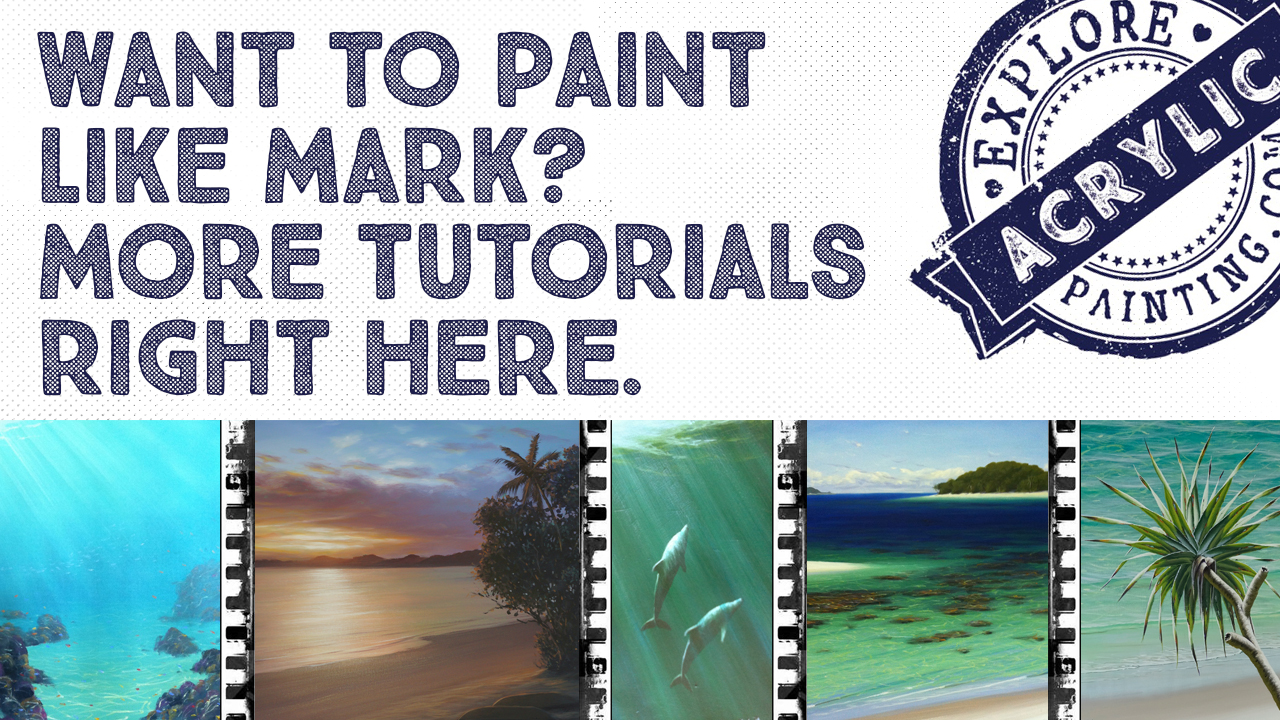
- Home
- Painting Tutorials
- Painting a Moonlight Scene
Painting a moonlight scene. Discover just how much colour you can get in there!
Learn how to paint waves at night by painting the “not-waves”.

Generally when we paint water, we’re sometimes not sure where to start. So in this painting a moonlight scene tutorial, it’s all about narrowing our attention in different directions to make it easier to break the process down. This is a useful technique for any painting - this concept should expand your entire repertoire of painting waves and water.
Painting a moonlight scene is a beautiful opportunity to add so much more colour than you could even imagine into your paintings! Get rid of those dead shadows and follow along :)
This is a tutorial we did at a recent workshop in Woolgoolga, and then re-filmed the process and put it on Youtube. So you can just follow along with that process if you want! Scroll along for the whole the written formula.
First up, materials needed for this painting a moonlight scene tutorial:
What You Need:
Atelier Artists Acrylics:
For the Background:
I used Atelier Free Flow (but you can use Atelier Interactive if you like)
- Pthalo Blue
- Dioxazine Purple
- Titanium White
- Cadmium Yellow Medium
For the "Not Waves":
I used Atelier Interactive (but you can use Atelier Free Flow if you want):
- Burnt Umber
- Dioxazine Purple
- Pthalo Blue
I use Artists quality acrylic paints by Chroma Australia, Atelier Interactive and Atelier Free Flow.
Canvas:
- 45cm x 61cm stretched canvas, portrait orientation
Brushes:
- For the background: 7cm house painting brush
- For the waves: Size 6-8 soft flat brush, an old scrubby kind of flat brush that will create a softer mark, another soft flat brush size 4-6, very small flat brush size 2-4.
Extras:
- White chalk
Here we go!
We’re going to start with blocking in our background first. Mix up a dark colour using Pthalo Blue and Dioxazine Purple to create a warm, dark blue. Paint this down your canvas about three quarters of the way. Then mix up a “dark sand colour” using Dioxazine Purple, Cadmium Yellow Medium and a bit of the previous water colour and paint this in a band at the bottom of the canvas. Let this dry.
We’re then going to establish some boundaries with chalk. There is no horizon in this moonlight scene, but we need to look at the idea of perspective. In terms of structure, we need to establish where the waves are in relation to one another. The ocean has a vanishing point - the sizes and distance between these elements vary.
So our first decision is where the waves will go, between the wet sand and the top of the picture. The distances apart will be roughly equal in this painting because we are looking down on them.
Now - an exercise with the chalk. Draw in your “not-waves”. We are going to imagine a moon and we’re going to leave gaps for the faces of the waves and reflect that moonlight with those soft scallopy reflective shapes.

In this tutorial we are painting a moonlight scene. The moonlight reflections are slightly scalloped ripples. When a wave breaks in shallow water, those reflective ripples are generally going to appear flatter.
So, let’s put some paint out! We’re going to use Atelier Interactive - dish out about a teaspoon of White. This will be thinned with water, paint your strongest colour down first on the steepest edge of the lip of the wave, where the reflection appears strongest.
We’re starting with White in this case because this image doesn’t have any structural elements like a landscape might do - so in this case our darkest darks and lightest lights become the structure.
Use a brush that is fairly small and flat, and start at the top of the painting and gradually work your way down, so you don’t get paint on your hand.
The wave right at the top of the painting (out the back) is in the deepest water, so we don’t want a steeply breaking wave. In order to create the illusion of this, you can paint some ripples down the face of the wave.
TIP: Train your brush to use the corner, or the flat part of the brush to make nice scallopy lines.

In this moonlight scene painting, our “warm to cool” colour spectrum is radiating from the middle white light (the moon reflection), and we’ll go through the spectrum to the coolest areas of the painting through to the edges.
So, we’re going to mix up our next darkest colour - using a mixture of Permanent Alizarine and Pthalo Blue, leaning more towards the Pthalo Blue. Add a tiny amount of Cadmium Yellow Medium to “grey-ify” this colour a little. This colour will be your “surface of the water furthest away from the light colour”. This should be quite dark (but slightly paler and warmer than your background), and mobile - add water to achieve this mobility.
TIP: It doesn’t matter exactly what colour this is - but this becomes your framework between that and white. Establish your darkest darks and lightest lights, and work backwards from there.
When you get to the shallowest water, flatten and soften your brushstrokes - you don’t need so many ripples in this area as it is very shallow!
Whoops - we’ll backtrack a little bit here as I forgot a little process. Use a broader, flatter brush, and neat, thinned White to establish the edge of the wet sand.
HOMEWORK: Have a look at where the damp sand and wet sand interacts -
sometimes it’s a very sharp transition!
Use the very edge of the brush to establish the edge of that shallow ripple in the foreground.
Now, we’re going to start our see-saw/pendulum kind of process with this moonlight painting scene. We’ll go back to the next lightest colour - using White with a TINY bit of Cadmium Yellow Medium added. We’re creating a transition between the lightest light as the light radiates out. We’re basically creating a gradation through the spectrum from the brightest light radiating out to the darkest, coolest areas.
The process from now on - we’re going lighter into cooler, and also, darker moving into warmer. The reason we are going back and forth like this is so it’s easier to stay within this “lightest light, darkest dark” framework.
So now, we’ll mix up our next transitional dark colour, using Permanent Alizarine and Pthalo Blue and a little bit of White, but learning more into the Alizarine, making a purplish colour (paler than the first dark colour).
TIP: Use short, straighter strokes to create the illusion of whitewash in the shallower areas.

Now, we’re going back to our see-saw - we’re going to mix up a kind of a peachy colour. We’re going to use our yellow colour from before and add a tiny bit of Permanent Alizarine and White, and paint the ripples in the transition area of the yellow going out into the purple area.
TIP: Water as we’ve mentioned, is highly reflective!
It’s ok if some of these ripples “cross over” into the other reflection areas.
Just to show you how this works from a to-and-fro perspective, and to reassure you about the process, I used White and strengthened up the light reflections right in the centre of the light source - this may have to be painted a few times.
I am using White Free Flow here - it is great for this technique. You can go really strong with the white.
The next colour transition is a mixture of the previous peach colour, and the darker purply colour from earlier - this colour will be halfway between each of these colours, and is the transitional colour that should bridge the gap. This could be the transition colour that pulls it all together! (However, always be prepared to do more :)
Grab a clean damp brush and paint out the chalk marks at this point, to tidy it up a bit.

At this point mix up the darkest dark of Alizarine and Pthalo Blue, and paint the base of this whitewash, which is the shadow that the whitewash is casting. While I had that colour I painted some here and there in the actual faces of the waves, in the areas of the painting that are the most shaded.
The waves - So, we’re going to get a little bit of Permanent Alizarine, Pthalo Blue and White, leaning more into blue - a bluey grey colour. We’re going to start putting some highlights in the shadows of the whitewash. I’m going to paint this colour in the face of the waves out the back, running some ripples up the faces of these waves to eliminate the idea that these wave are steeply breaking. But still leaving gaps in the middle for the “windows” so the wave does appear steeper than the lit areas.
I painted this colour into the shaded areas at the front of this wave. This is to create the illusion of the wave breaking onto a flat surface (mirror).
Next up - I added a leading edge to the lip of the wave breaking to give it that hollow curling form.
Sometimes with painting it’s the things we put into the painting that the viewer is unaware of. Detail in the shadows is one of these things. You can put loads of detail in your shadows and this will add so much depth and realism.
Now for some glory! This next process represents the light shining through the back of the waves. I mixed up a colour to paint in the faces of the waves - a dark greeny-blue colour using Pthalo Blue, Cadmium Yellow Medium and White and painted through the face of the waves right through to the whitewash (Started towards the top of the face of the wave). I added a tiny bit more yellow to that, and a teensy bit of white, and painted this colour over the top of the first colour, down to the middle area of the face of the wave, softening it down so that it appears to be a gradation in the face of the waves.
I painted this colour here and there through the painting wherever light would be shining through the back of a wave.

I added more white and more Cadmium Yellow Medium to this colour and painted again, along the top of the face of the breaking waves, fading downwards.
When a wave rears up to break, you can see the light shining through the back of it. As the wave folds over and breaks, you see through two lots of water. So the green colour won’t be as strong where the lip is folding over. The darker part at the top is the lip (the thick bit) where you’re seeing through more water, therefore it is darker. More water = less light travelling through it.
I added more Pthalo Blue to the colour above to represent the thicker part of the wave.
At the moment we’re actually painting the waves, not the “not-waves” :D Painting the not-waves is actually the largest part of this picture.
At the blocking in stage of the painting, you start looking at the painting; asking what is working, what isn’t, and tightening those things up. What we have to start doing now, is looking at our picture more critically. So we’re going to just sit and look at your picture and ask yourself whether or not you have created the illusion of moonlight scene, or not. If you think you haven’t, rigorously explore why, and train yourself to observe critically your paintings.
In a painting, everything is relative. We tend to look at one thing, and think “that’s wrong”. A better approach is to try and look at the context instead, in this example asking ourselves what we are really trying to achieve in this picture. You need to figure out - What is the story I want to tell? What isn’t working? What am I going to do to make it work?

Remember - we are all different - you have a different eye, a different way of doing things. There is no “right” way, just a framework for yourself to work comfortably in.
So, the process of warm to cool in the light areas, and warm to cool in the dark areas is what we’ve covered. If you’re having problems with your painting, keep going back to this process.
So, next up, and to finish off this painting - we are going to add a few little zippy details. Using White Free Flow, I added some feathering to the front lip of the breaking wave. I then bumped up the whitewash areas close to the light source and re-established the lip running through the face of the wave using that darker burgundy colour from earlier, Pthalo Blue and Permanent Alizarine. I decided that the whitewash in the shadows was a bluey/grey colour. I used this colour to feather off the top of the wave with a mostly dry brush. This will be a little darker than the reflection behind the wave because it will stop light. However the area directly in front of the light source will be lighter and warmer. Some subtle reflections were added under that whitewash vertically and horizontally using the same colour. Using the peachy colour from earlier I added highlights to the whitewash of the breaking wave.
Following the same colours as above, I started creating some whitewash trails. I used White Free Flow and a little bit of water for this part of the process in the middle where the light source is strongest - Free Flow is just excellent for this. In the areas to the sides where the shadows are, use the same whitewash shadow colours to create those suds trails.
I then used Free Flow white to define the front edges of those very small waves in the front.
I then added a pile of water to the white and added a tiny parallel reflection under this tiny wave. He added further suds using Free Flow White just in the centre where the light source is strongest.
TIP: White tends to go a little bit transparent and blue - when you thin it out with water you can use it as is, painting out into the shadow areas and that saves you having to add blue to it!
The rest of the painting at this point is to-ing and fro-ing. Bumping up parts that you like and diminishing parts that you don’t.
One last thing - there is a fun glazing technique using neat Cadmium Yellow Medium and a very dry brush - brush in those areas of the reflections between the white and the shadow areas to create a gorgeous, cohesive and soft transition. Glazes are great for subtly changing the image.
One thing about moonlight on the water is that it is very intense, and there is a lot of light bouncing around. So using a dry brush again, I used White and brushed horizontally across those areas of most intense light again to bump those areas up. Don’t be too scared to get right in there with the white, this will really pull those areas forward. Andddd voila, your moonlight scene is complete! Hope you had heaps of fun with this one.
Check out the full tutorial on Youtube here:

Search This Site:

WTH is Acrylics Anonymous?
For more great painting tips, subscriber only specials and zingin' humour (hmmm, maybe?), subscribe to our monthly e-zine, Acrylics Anonymous. It’s fast, free, and we don’t send you junk. As a valued subscriber, you can purchase our 3 pack of downloadable how to paint with Mark Waller DVDs for only $80, or our downloadable V-log “Coral Reef - Underneath” for only $12.
See your subscription confirmation email for more details.
Subscribe here:
Recent Articles
-
Upcoming Workshops with Mark Waller
May 26, 26 01:20 AM
 Upcoming workshops & tutorials in your local areas, check here!
 -
Workshops past. Been & gone. Delve into past notes, info and stories.
Apr 20, 26 07:27 PM
 Mark Waller's workshops past - discover what was learned about, talked about, laughed about and consumed with gusto!
 -
Mangrove of Costa Rica
Feb 09, 26 08:25 PM
 I often visit my sister in Costa Rica where she and her husband live. They have a vacation destination business. People come to stay at one of the homes
 Subscribe to this site!


![]()
About Us | Contact Us | Sitemap | Disclaimer | Privacy
Our Partners:
Copyright© 2007- All Rights Reserved