Gradation.
A Fundamental Skill
For You To Learn.
The basis of most successful
paintings is gradation.
Learn the rules (then break them).
A gradation is a smooth blending of color in which the transition point between colours should not be apparent.
Whenever I run workshops, one of the first things I get EVERYONE to do, is a simple blend of color. We do this exercise over small and large areas.
This is designed to develop the skills and “touch” needed to pull colors together smoothly and adeptly. It is amazing how many accomplished painters can’t do this quickly and effectively.
In the real world, not all gradations are a perfect transition. However, mastering the skill is an incredibly valuable exercise. It gives you confidence and options. Once the skill is developed to a reasonable level, we then introduce other colors. For example Pthalo Blue + Cadmium Yellow Light + White (a gorgeous tropical water color).
It is one thing to go from white to blue; it is another thing entirely to shift through three or four shades and hues smoothly.
Blending Color
Painting subtle shifts in hue in skyscapes, or the gradation of color in a figure becomes so much easier when you can blend colors efficiently.
Most of us do our “training” on one of our "real" paintings. The pressure’s on. That’s why it’s a great idea to practice skills on something that means nothing to you. You’ll improve much faster!
Whatever your skill level, you should do this exercise occasionally prior to starting a painting:
| An Exercise - Gradation - Blending Colour |
|---|
You will need:
- Your large palette
- Your large water pot
- Canvas (or preferred primed surface)
- Your favourite color (we have used Pthalo blue)
- White
I use Artists quality acrylic paints by Chroma Australia, Atelier Interactive and Atelier Free Flow.
We want to do a gradation of color, from a pure version of your favourite color, to white (no water or mediums added).
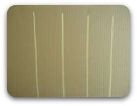
It’s a great idea to learn to manage your palette while doing this exercise. Marking chalk lines/columns on your palette is an easy way to do this, especially for beginners.
Start with your chosen colour at the top of the column on your palette (cool blues below the cool blue column, warm reds below the warm red column) and apply in a broad band on your canvas.
Back to your palette, add white to your colour and mix it in the column below the first colour.
Now, on your canvas, add it in a broad line below the first. "Pull" the two colours together with your brush. It should be almost impossible to find where the deeper colour ends and the paler colour starts.
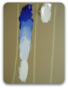
Repeat this process until you reach pure white at the bottom.
There is a trap here. If you want pure white, you will need pure white! That means your brush needs to be cleaned thoroughly, before you add any white. Any remaining color in your brush will taint your white.
THIS IS IMPORTANT!!
Most people don’t stop to take all of the color out of their brush at critical times, before adding another pigment. This is why we so often end up with “mud”.
When you become confident that your gradation is smooth over a large-ish area, compress it into a small one. Then do it over a huge one!
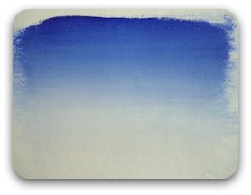
Gradations over varying sizes will test your skill!
We’ve talked about using this chalk line strategy for blending colors in a gradation.
As a bonus, using the chalk lines will save some pain when you're mixing color. It will keep the colors clean, uncontaminated and organised.
It is also a great visual reference for those who are not comfortable at recreating colors at a whim (I would think most of us).
Mixing Color:

In this next exercise we will not be focussing on color theory. All we are interested in is the physical process of mixing colors together on a canvas, and how best to do this.
Let’s go back to the gradation exercise to explore this further.
As I am most often asked about the way I paint water, we are going to use these colors as the foundation for this exercise.
| An Exercise - Gradation - Mixing Colour |
|---|
You will need:
(note, these are Atelier Interactive Artists Acrylics, you should use a cool blue and cool yellow as alternative colours):
- Your large palette
- Your large water pot
- Canvas (or preferred primed surface)
- Large paintbrush (size 10 or 12)
- Pthalo Blue
- Cadmium Yellow Light
- Titanium White
Grab your very large palette (which is close to your very large and stable water pot!), draw some vertical chalk lines, and dish out these three colors, see photo.
Now with a large-ish paintbrush (size 10 or 12), in the column directly beneath the blue, drop a dollop of blue. STOP. Go get another dollop. I’m betting you didn’t put enough out!
Mix up heaps of paint. Now add some Cadmium Yellow Light and some White, and mix the colors together, staying in your blue column.
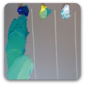
For this exercise, I want you to mix the colors completely on the palette so that there are no flecks of the pure color remaining. The colors should be mixed together completely; the start of your smooth gradation.
When you have a beautiful sea-type turquoise color, paint it across the top of your canvas. Use plenty of paint and apply in a "crosshatch" pattern.
If at this point, you are finding that the holes are showing through in your canvas and you are having to “scrub” the paint on, you didn’t mix up enough paint! Go to the corner, do some push ups, and come back. Dish up some more paint and mix again.
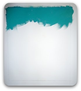
For those of you who are not doing push ups, grab another dollop of Pthalo Blue (a much smaller dollop than before) and a dollop of the Cadmium Yellow Light (more than last time), and add a bit more white. (NB: "A bit" is a technical term; somewhere between "a lot", and "not much").
This color should be mixed just below the previous color. The color you have created now should appear "yellower", and paler. Add it to your canvas, blending back into to the previously applied color, again using cross hatch technique.
The push up crew are back with us now, and won’t make that mistake again (will they?!!). Note - don’t do too many push ups so that you can’t pick up your paintbrush.
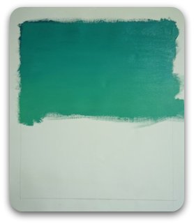
Continuing down within your chalk lines, repeat the process adding more Cadmium Yellow Light and more White, so that your color appears "yellowerer" and paler again. Paint this color as before, blending into the previous color above.
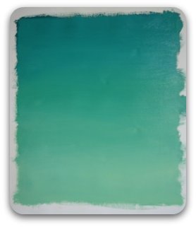
Continue adding more White and Cadmium Yellow Light until you reach the bottom of the canvas.
You should have a even, lovely ocean-like gradation of color.
When you feel comfortable with this, pick a different mix of colors. Those representing a gentle skyscape for example. For those of you starting out I recommend nothing too dramatic. Build up to glorious sunsets, ease into the folds of sheets. Suffering for your art is not mandatory (nor even necessary).
Remember, these are just exercises ( that's why I threw in the push-ups).
And we all know exercise is good for us!
I know I rave on about managing your palette. So I will again. Knowing where your color is on your palette minimises the possibility of your brush touching a color you didn’t want. Nasty.
Managing your palette in this way, gives you a visual history which eliminates confusion and allows easy reference to colors used along the way. The added benefit is that you can often, in the case of products such as oil paints, or the Atelier Interactive range which will stay mobile, go back and use paint without having to remix colors.
The benefits of being able to effectively and efficiently create a smooth gradation of colour are limitless.
Gradations are everywhere. Take some time next time you are outside, notice the gradation in the sky. Is it even? What is causing the blend? What time of day is it? What's going on in the atmosphere to alter the colors or transition of colors or hues?
Hone in on gradations you may not notice so easily. Pick a leaf from the tree, notice the varying greens, or the gradation from red to yellow to green to brown.
Once you learn how to achieve a smooth gradation, you can certainly achieve a loose one. A "loose" one is easier to do and probably a little livelier and more natural.
Tuck in to the world. The process of finding amazing and subtle gradations will improve your art (it'll make you live longer too).
Chuck some paint around, celebrate your discoveries and recreate the colors, the feeling, and the magic. It doesn't get much better.
Back To Explore Acrylic Painting Home Page






New! Comments
Have your say about what you just read! Leave me a comment in the box below.