| Back to Back Issues Page |
 |
|
Acrylics Anonymous, Issue #136 -- The Sound of Colour. October 01, 2025 |
Passionate about painting with acrylics? Need a monthly fix chock full of inspiration? Need some help to take the pain out of your painting process? It's all here for you. Acrylics Anonymous. Zero elitism. Dive in. If you enjoy Acrylics Anonymous, and you know someone who might also enjoy it, you can share by forwarding it to your friends! If you are receiving this because a friend has forwarded this to you, and you would like to subscribe, click here! 
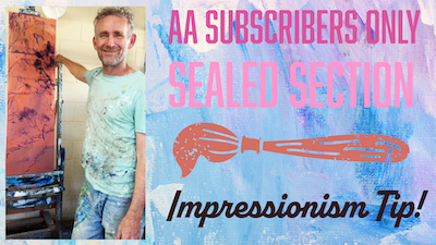
Every month, we will produce a Subscribers Only "sealed section" - just keep scrolling to see it. It could be a painting technique, a short video tip, or anything we can think of that we reckon you might enjoy. Please let us know what you think, we love your feedback! To leave comments, contact us here.

Impressionism Tip When painting in an impressionist style, a good trick is to use a smaller brush than you normally would, which does a couple of things. This breaks up your brushstrokes, creating a looser more impressionist feel, and at the same time allows colours from underneath to show through the gaps more. 
News and more news! You may have noticed if you are on our other mailing lists that we are sending more regular emails. If you want to be first in line for workshop news, painting studies, book news and more, make sure you sign up here!
Workshops 2026 Our 2025 workshops are now fully booked, and at this point in time we don't have anything fully locked in for next year (there will be a Fiji trip but we're unsure of dates yet!). Get in touch if you'd like a workshop in your area! Contact us through this form and tell us what you'd like! New on Youtube! We have a couple of tutorials you may not have seen, check them out below. Watch Sunkissed Sand Dunes full tutorial on Youtube! Watch the Number 1 Painting Skill that will change Everything on Youtube! ....And coming soon.....The 6 Reasons Your Paintings Don't Look Real! Keep an eye out of that one, or make sure you're subscribed to our Youtube channel and notifications turned on :D  Every month, we choose an Artist from our
forum
to showcase.
Every month, we choose an Artist from our
forum
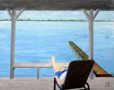
to showcase. You can even nominate someone if you like. (Or yourself!). To do this, check out the forum and then send us an email! It’s that easy. This month we're featuring artist Larry, from Sunrise, Florida with his painting "Inspired to do Nothing". Thanks so much for sharing your painting with us Larry - such a peaceful scene :) Click here for more on Larry's painting "Inspired to do Nothing"

Swiss artist Zimoun creates all encompassing sound-installations using simple mechanical sculptural elements. These fascinating displays have a depth of resonance that reverberates and touches our shared human acoustic experience. See his incredible work on many platforms, but go to his website first. Sardinian artist Pinuccio Sciola was a painter, sculptor, and carver. His life mission was to recreate a new relationship with nature, with work, with love and with the sounds of the Stones. Read more about Pinuccio and his sound garden and museum here:
Check out Pinuccio's philosophy here.
If you have a link you like, please share it with us! You can contact us to let us know. Thank you!  This is the section where you can "get your name in lights!" (well at least out there in the internet world!).
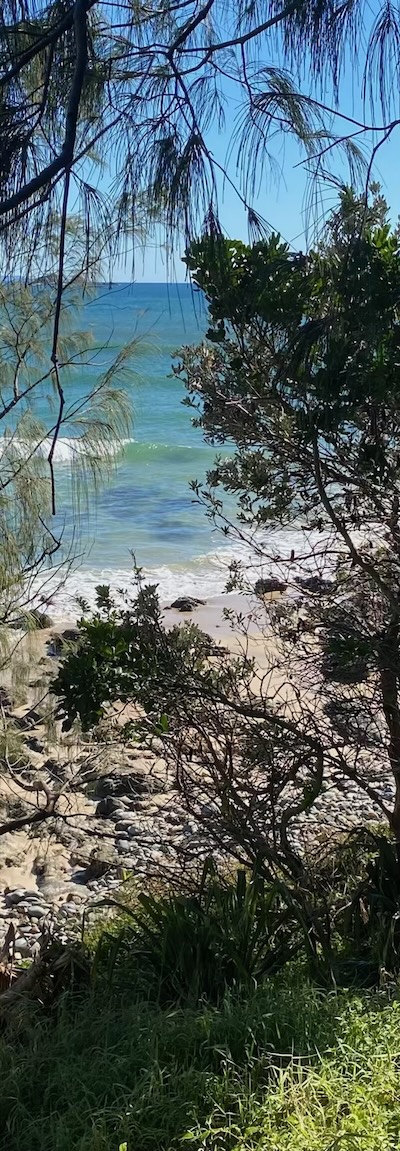
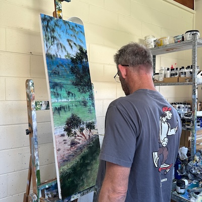
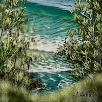
If you have works in progress you would love to show off, or finished pieces you are particularly proud of, we would love to see them! We especially like to hear about the story behind the creation. This month's submission comes again from courageous commander, Mark! From Mark: "On recent trips to major galleries both in Canberra and Victoria, I was inspired by the difference between a painting viewed up close to one viewed further away, and couldn’t help but marvel at how much build and texture was obvious in a painting viewed up close, versus how “realistic” it looked viewed from a distance. I’ve always loved being able to look through layers and flecks of colour to see the bones of a painting underneath, so was inspired to go back to an older, more impressionist style.
I loosely painted the canvas with a coloured ground, based on Cadmium Orange, Dioxazine Purple and Cadmium Yellow mixed together and thinned (see Sealed Section video above). This gave me a foundation colour for all the work to come later. I chose this orangey colour because it contrasted nicely with the colour range I was going to paint. I wanted a simple image that was still spacious but one that didn’t really have a definitive focal point. I wanted to create the illusion of depth and distance, a bright sunny day and clear water, viewed through foliage specific to my area. And I wanted to “abstract” the marks without drawing attention to any particular area of the painting. The long skinny format with the steps from the foreground into the background, combined with the perspective broken by miscellaneous branches and trees, create a wonderful opportunity for abstraction, a looser approach and to actually play with the dynamics of paint, creating a
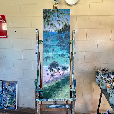
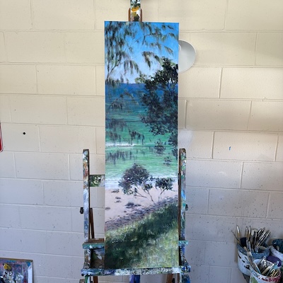
compelling image and an intriguing canvas surface.
It’s one thing to create a picture. It’s another thing to create a surface that supports the picture, but that adds another creative dimension to the artwork, and in itself helps it tell the story. It’s also art on its own, art without the image. I sketched the elements in with Dioxazine Purple. You can see a bit of this process in the Sealed Section video above too :) Once that was done, I mixed the sand colour first, for no real reason. Once I finished that I mixed French Ultramarine Blue and a huge quantity of white to that previous sand colour and painted the lower part of the sky, blending upwards and adding more French Ultramarine Blue and some Pthalo Blue (I mixed the sand colour first because I wanted a hint of that in the lower part of the sky. Two birds, one stone). When I painted the lower part of the sky I also painted the reflection on the wet sand. Some might say lazy, I say efficient. I then worked from the horizon down,
originallly starting with predominantly French Ultramarine Blue, adding Pthalo Blue and eventually Cadmium Yellow Light to this water colour the further down the canvas I went.
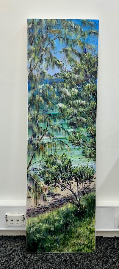
I mixed up a darker colour, Dioxazine Purple and Pthalo Green and a tiny bit of Cadmium Yellow Light and painted the shaded grassy areas on the bank, and the darker areas in the foliage. I scrubbed in some branches and then placed a few highlights on the wispy Casuarina tree leaves. So far, I’ve used one brush (a size 6 flat in case anyone’s interested). I repeated that entire process, making modifications to the colours and shapes as I went, but I was still using a small brush to allow the discrepancies in colour and brushstroke to remain in the picture. This creates a broken yet kaleidoscopic effect, which is one of the wonderful aspects of impressionism. Unexpected flecks of colour spread throughout the picture.
I started adding some reflections on the surface of the water. Then using a shorter flatter brushstroke, and a mix of Cadmium Yellow Light, Pthalo Blue and White, and then Cadmium Yellow Light, Pthalo Green and White, created the impression of light refracting through the surface of the water and flickering over the sand. I came back then and re-established the trees, and began to place rudimentary highlights strategically through the picture. I used a fan brash for this to avoid becoming too controlled, particularly in the grassy area in the foreground. I then began to paint more detail here and there with lighter flashes of foliage colour, whilst also placing flecks of pure colour here and there through the picture. Cadmium Orange is sensational for this. Then using a liner brush, I worked over the painting establishing the finer branches, shadows under the rocks and stones on the sand, and creating the impression of sticks and errant leaves in both the grass in the foreground and the trees towards the top of the picture. Lots of colour and contrast, and I think a lovely image."
Until next time, make sure you stay safe and well, and don't forget to chuck some paint around! Cheers from Frankie & Mark :) For our Youtube channel, click here. To join our Youtube channel as a member for a few bucks every month (in exchange for even MORE awesome perks, click here. For our Instagram, click here. For our Threads, Click here. For our Website, click here. For our Facebook page, click here. For our Pinterest, click here. For our Tik Tok, click here. |
| Back to Back Issues Page |