| Back to Back Issues Page |
 |
|
Acrylics Anonymous, Issue #115 -- Pushing The Boundaries Of Luminosity. June 01, 2022 |
Passionate about painting with acrylics? Need a monthly fix chock full of inspiration? Need some help to take the pain out of your painting process? It's all here for you. Acrylics Anonymous. Zero elitism. Dive in. If you enjoy Acrylics Anonymous, and you know someone who might also enjoy it, you can share by forwarding it to your friends! If you are receiving this because a friend has forwarded this to you, and you would like to subscribe, click here! 
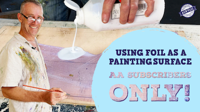
Every month, we will produce a Subscribers Only "sealed section" - just keep scrolling to see it. It could be a painting technique, a short video tip, or anything we can think of that we reckon you might enjoy. Please let us know what you think, we love your feedback! To leave comments, contact us here.

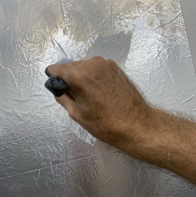
Quality of Image Think about the quality of the image that you are trying to create. Do you want it bright and luminous? Or heavy and oppressive? You can achieve those effects with the paint of course, but think also about the surface you are painting on, and whether or not that supports the image you want to make. Something that is often overlooked, but can make a big difference. For example, I'm painting on foil right now - luscious luminous, amplified depth and colour. 
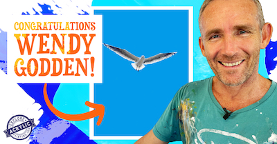
Congratulations to Wendy Godden for winning the Mark Waller original seagull painting valued at $1100! Thanks to everyone for entering and we hope you all had fun painting seagulls! In case you missed the tutorial, here it is! New YT Short! Mark's new Youtube shorts series "So I Paint" thoughts from the easel continues! We have some another new short from Mark's vault of thoughts/poems. We hope you like this, the third in this series: "Just An Eye". Click here for the short Just A Moment Exhibition Mark's exhibition and book launch are coming up quick! Here's all the info and we hope to see you on opening night, June 24th 6pm at Lennox Arts Collective gallery! For more info, read on!  Every month, we choose an Artist from our
forum
to showcase.
Every month, we choose an Artist from our
forum
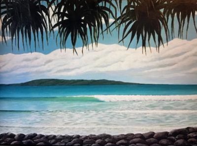
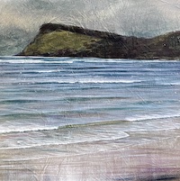
to showcase. You can even nominate someone if you like. (Or yourself!). To do this, check out the forum and then send us an email! It’s that easy. This month we're featuring artist Margot, from Currumbin Valley, Queensland with her lovely painting,"Pandanus Beach". Thanks so much for sharing this with us Margot, we are so happy your daughter is hanging it in her place! Click here for more information on Margot's "Pandanus Beach"

Jordan Sprigg is an Aussie sculptor you’ll definintely want to check out. Think large, complex works, recycled metals, all that good stuff! Check out Jordan's scultpures here! Remco Kingmans is an emerging Dutch artist. His practice embraces many art forms ranging from animation, 3D printed jewelry to sculpture and public Art. Check out some of his anamorphic art right here. Here's some interesting anamorphic art for your eyeballs! If you have a link you like, please share it with us! You can contact us to let us know. Thank you!  This is the section where you can "get your name in lights!" (well at least out there in the internet world!).
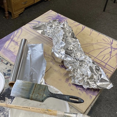
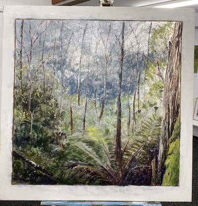
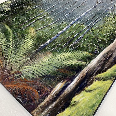
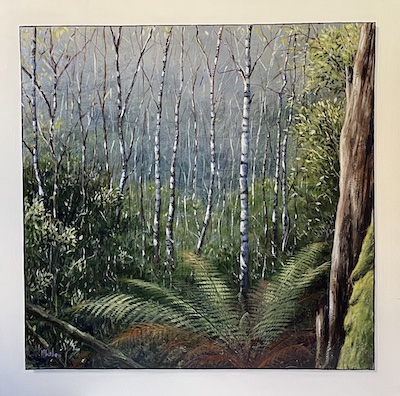
If you have works in progress you would love to show off, or finished pieces you are particularly proud of, we would love to see them! We especially like to hear about the story behind the creation. This month's submission comes, again from our very own Mark Waller with his painting "Shimmer". From Mark: "On a recent trip to Tasmania, my wife and I walked through a National Park into a place called Snug Falls. As we dropped further into the valley, the air became cooler, the vegetation changed, and there was a mist that softened light. There was almost a metallic sheen to the air in the distance. Of course I took about 8000 photos. Still in Tassie, I went to a gallery and came across these wonderful photographic prints on aluminium panel. There was a lovely sheen to them. I couldn’t help seeing the parrallels between those images and some of the ones I had taken photos of. When I got back to the studio one of the first things I did was buy a couple of meters of foil, and started experimenting with gluing them down.
Both Binder Medium and Heavy Gel Gloss are fantastic for that, although I recommend using Heavy Gel Gloss on canvas because the canvas is a bit more flexible. I wasn’t trying to get the surface perfectly flat. After I was sure it was stuck to the canvas, I gave it a couple of coats of Heavy Gel Gloss to hide any seams and to give it a bit of build, and then when dry, a coat of Binder Medium so that the paint would stick. I had to paint this in an entirely different way from usual, because I wanted the foil to show through here and there. I used Atelier Interactive for this project because it’s a little more transparent that Free Flow. And I wanted that lovely silver to come through.
I roughly drew in all my major shapes so I knew where everything was with a diluted mix of Dioxazine Purple and Binder Medium. I then made a series of very thin washes of French Ultramarine Blue, a tiny bit of Burnt Umber and yellows and Glazing Liquid, and gradually built up the colour from the soft blues in the distance, to the greens and browns in the foreground. My primary focus at this stage of the painting was the lovely blue sheeny area in the distance. Really wanted to hang onto that. Once I was happy with where that was, I started to mix more “solid” colour, and really push it into the darker areas (despite the fact that I put a lot of paint on, there are still flecks of that metallic surface coming through). After another coat of Heavy Gel Gloss, I grabbed the edge of a brush and started marking in the trees in the distance with French Ultramarine Blue, Burnt Umber and White, and of course a few branches here and there that were Burnt Umber, or
Burnt Umber + French Ultramarine Blue.
I strengthened up the darker green leaves and areas of the picture, and roughed in quite solidly the mossy tree trunk in the foreground, and some of the other more established trees. This of course was followed with another coat of Heavy Gel Gloss. I then started to establish some of the highlights in the bush in the background with very subtle additions of yellow and whites. I also “formed” some of the leaves in the mid ground area to suggest trees and branches encroaching across into the view. I came through then with some highlights, and suggested the patches of light that had filtered through the canopy and hit the trunks. Those birch trees have that quite distinctive pattern, so I made those dark markings down the length of the trees, and added branches here and there. I then used predominantly French Ultramarine Blue and White to create highlights on the left side of the branches, then finally came back with White, and touch of French Ultramarine Blue and
a miniscule hint of Cadmium Yellow Light. This was the final suggestion of direct light hitting the trees.
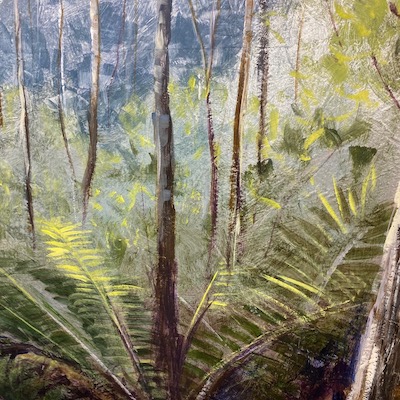
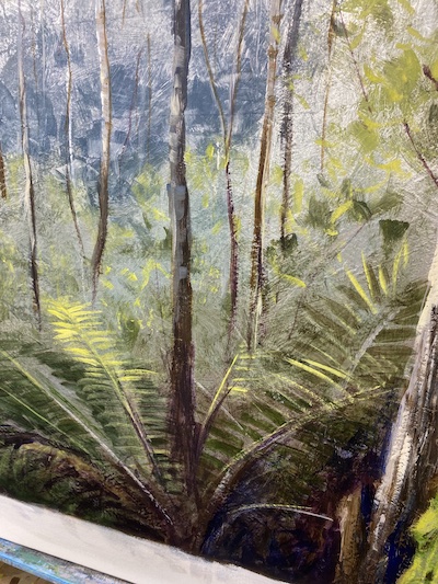
I dragged the edge of a finer brush here and there across the picture to suggest that the sunlight was hitting branches here and there. I then mixed up some more green - French Ultramarine Blue, Forest Green, Dioxazine Purple and Cadmium Yellow Medium. The colour leaned still towards blues. I then pushed that as a glaze in around the closer areas to the bottom of the picture and the foreground, to create some contrast and dimension between that area and the distant blues. I started to establish the shapes of the foreground tree fern. Still very broad strokes at this time just to define it. At this point I lay the painting on the floor and flicked a few greeny-blues and olivey colours over it to suggest flashes of colour in the mid/foreground area.
I used quite a fine brush and started working on the leaves of the tree fern that were in shadow, and gradually added more yellows and whites to areas that were being hit by sun, and pushed some bluer colour into some leaves to create the impression they were leaning away. I did something similar with the dead leaves in the foreground, rather than using the greens I used Burnt Umber, Dioxazine Purple and Cadmium Yellow Medium. Lovely rusty dead fern leaves. This also had the benefit of bringing some warmer colours into the foreground, which added to the illusion of dimension. It was a simple matter then of coming back here and there with leaf highlight colours, tree trunk highlight colours and adding flecks of colour all over the picture. I finally tightened up the moss on the tree trunk in the foreground, deepened some shadows here and there in the picture, and voila it was done.
I then added several layers of Universal Medium to create that lovely high shine finish. Then I painted a thin line around the edge and a drop shadow (for fun) and tidied up the white border. Everything outside the picture was coated with Matte Varnish.
Click here for his (new) Instagram, his other account was compromised. Click here for his Facebook And click here for his Website! We hope you enjoyed this issue of Acrylics Anonymous! If you have any suggestions, comments or feedback for the ezine or our site, please don't hesitate to contact us. Until next time, make sure you stay safe and well, and don't forget to chuck some paint around! Cheers from Frankie & Mark :) For our Youtube channel, click here. To join our Youtube channel as a member for a few bucks every month (in exchange for even MORE awesome perks, click here. For our Instagram, click here. For our Website, click here. For our Facebook page, click here. For our Pinterest, click here. For our Tik Tok, click here. |
| Back to Back Issues Page |