| Back to Back Issues Page |
 |
|
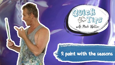
Acrylics Anonymous, Issue #086 -- Spring Clean! October 01, 2019 |
Passionate about painting with acrylics? Need a monthly fix chock full of inspiration? Need some help to take the pain out of your painting process? It's all here for you. Acrylics Anonymous. Zero elitism. Dive in. If you enjoy Acrylics Anonymous, and you know someone who might also enjoy it, you can share by forwarding it to your friends! If you are receiving this because a friend has forwarded this to you, and you would like to subscribe, click here! 
Every month, we will produce a Subscribers Only "sealed section". It could be a painting technique, a short video tip, or anything we can think of that we reckon you might enjoy. Please let us know what you think, we love your feedback! To leave comments, contact us here.
Click here for your exclusive video!

Dry Those Brushes! When painting with acrylics you tend to wash your brushes out a lot. This can cause issues when you then go to pick up paint, and find the paint consistency has too much water in it. I always have a couple of old towels or absorbent rags close by to dry my brushes out properly, before I pick up more paint. 
Workshops! We still have a few places coming up in our Esk workshop this month. If you've always wanted to paint the tropics like Mark does, now is your chance. For more information on this one, click here! Blocking In A Landscape. Check out the Tasmanian farmhouse Mark blocks in on our latest Youtube clip, exclusive to you! Click here for the video! Trying to find a tutorial? We have so many tips, techniques, tutorials and other useful info on our website, and to easily find it all, go to the sitemap here! Click here to explore the sitemap!  Every month, we choose an Artist from our
forum
to showcase.
Every month, we choose an Artist from our
forum
to showcase. You can even nominate someone if you like. (Or yourself!). To do this, check out the forum and then send us an email! It’s that easy. This month, it's Hailey GauthierHouston, Texas, United States, with her painting titled "CreateFloArt". She has some inspiration for us about how she got into acrylic pour painting! Click here for more information about Hailey's CreateFloArt

Land art or earth art is art that is made directly in the landscape, sculpting the land itself into earthworks or making structures in the landscape using natural materials such as rocks or twigs. Check out these 15 awesome examples of land artists. Click here to check out these 15 land artists! And, on a different form of “land art”, this art installation put together overnight in downtown LA as a gift to the city, is next level amazing! Check it out here: Click here for this beautiful kinetic installation. If you have a link you like, please share it with us! You can contact us to let us know. Thank you!  This is the section where you can "get your name in lights!" (well at least out there in the internet world!).
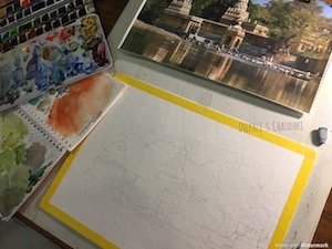
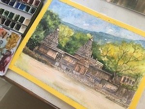
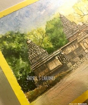
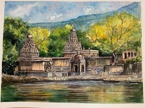
If you have works in progress you would love to show off, or finished pieces you are particularly proud of, we would love to see them! We especially like to hear about the story behind the creation. This month's submission comes from Deepali Chaudri - a fantastic artist from Mumbai. Deepali is sharing her watercolour piece today - "Wai" - The Temple Town in Maharashtra, India. From Deepali: "Through time and history many, many towns and cities have developed along water bodies - rivers, lakes, ponds, wells, seas, oceans... Each responds to its adjoining water body differently. And these differences are reflected in many different aspects - spatial, architectural, cultural, culinary and so on. The following illustration is part of an architectural study of the response to life along the Krishna River, in a little temple town called Wai, in the Indian state of Maharashtra. The treatment is therefore a little architectural, with its pen and ink work, and precise proportions and spatial relationships between buildings. The serene environment with its beautiful trees, calm waters and hilly background lent themselves beautifully to be expressed in watercolour. The entire area is absolutely breathtaking - the perfect setting for the Gods themselves to take a little time off from their business of running the world! And that is what I have tried to convey through this illustration!
The Process: The basic drawing of the buildings in the correct proportion was established lightly in pencil, on the final watercolour paper (in this case, a 9” x 12” Strathmore 400 series, 300gsm paper. It has a lovely cold pressed texture which is great for watercolour, yet subtle enough for fine pen work.)
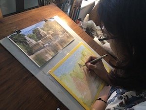
I then laid down washes of watercolour roughly, to establish some sort of atmosphere, if I may call it that. For the clear blue late Indian afternoon, I have used a granulating cobalt/ ultramarine blue with a hint of Potter’s pink in the skies. The foliage gets a wash of medium yellow, green-gold, sap green or van-dyke green. The building structures end up with some raw sienna and red ochre. I generally tend to paint intuitively with only a rough idea of where to start and then “let the paint flow where it may”. So I limit myself to a few well-chosen colours from my palette for any one painting, for a sense of harmony and naturalness in the artwork.
I then started inking with my trusty waterproof black Micron 0.05. The detail, for instance, on the temple top (“shikara”) is not exact, but it does convey the sense of it. Once the penwork looked more or less done - and in this case, better less than more! - I started adding details in watercolour. Shadows are in ultramarine blue and burnt sienna/burnt umber, with the addition of sepia, Payne’s grey, neutral tint or black for the darkest areas. The earlier greens were darkened using the same shadow colours, and spritzed with clear water for a watercoloury blending. Highlights were done with white gouache, white gelly roll pen or the Fabercastell white polychromos pencil for textural effects.
To paint the water, I wet the entire Ghat area with clear water. With a big round brush, I laid down bold vertical strokes of the colours used above, to show reflections. A “thirsty” flat brush helped lift out horizontal strokes, and thin wiggly lines in the relevant colours were added to enhance the feeling of reflections in the water. This process, like pretty much everything else, is a bit of trial and error, whereby one works in layers till one is satisfied. The last bit of details were added with the pen, and adjustments done with shadows and highlights, till the painting was deemed finished by my children!"
If you like Deepali's work and would like to see more, please check out her facebook page, right here. For Deepali's website, click here. And for her Instagram account, click here. Hope you enjoyed this issue of Acrylics Anonymous! If you have any suggestions, comments or feedback for the ezine or our site, please don't hesitate to contact us. Until next time, make sure you chuck some paint around! Cheers from Frankie & Mark :) |
| Back to Back Issues Page |