| Back to Back Issues Page |
 |
|
Acrylics Anonymous, Issue #117 -- Just Breathe. August 01, 2022 |
Passionate about painting with acrylics? Need a monthly fix chock full of inspiration? Need some help to take the pain out of your painting process? It's all here for you. Acrylics Anonymous. Zero elitism. Dive in. If you enjoy Acrylics Anonymous, and you know someone who might also enjoy it, you can share by forwarding it to your friends! If you are receiving this because a friend has forwarded this to you, and you would like to subscribe, click here! 
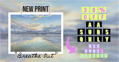
Every month, we will produce a Subscribers Only "sealed section" - just keep scrolling to see it. It could be a painting technique, a short video tip, or anything we can think of that we reckon you might enjoy. Please let us know what you think, we love your feedback! To leave comments, contact us here.

Not to get too hippy about it! But, bringing your awareness back to your breath, can help when your painting is threatening to overwhelm and overpower you. Try breathing in on four slow counts, holding for four slow counts, breathing out for four slow counts, and repeat this four times. You will be calmer, more focussed and less likely to throw your painting across the room! 
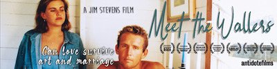
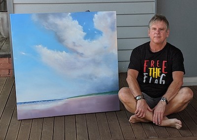
Meet The Wallers local screening sessions are coming up fast! Next up is Byron Theatre on the 5th August. Click the link below to stay up to date with screening and ticketing information! Click here for upcoming screening info and to buy tickets! New Short on the Tubes! Mark's new Youtube shorts series, "Thoughts from the Easel" continues with another musing from the master. We hope you like this, the fifth in this series: "Play. For Artists". Click here for the short clip. Simple. Yet. Here's a new blog post from Mark, an insight into managing thoughts after a life changing event. Click here for the blog post. Esk Workshop Tutorials Now Up On Youtube! Back in April we ran a workshop titled Early Morning Beachscape. In case you haven't seen Part 1 and 2 yet, here they are! Click here for Part 1. Click here for Part 2.  Every month, we choose an Artist from our
forum
to showcase.
Every month, we choose an Artist from our
forum
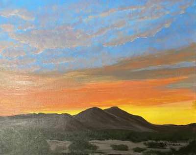
to showcase. You can even nominate someone if you like. (Or yourself!). To do this, check out the forum and then send us an email! It’s that easy. This month we're featuring artist Michael Reinsche, from Arizona in the US, with his gorgous, colour-drenched painting "Desert Sunset". Thanks so much for sharing this with us Michael, that is certainly a dramatic scene! Click here for more info on Michael's painting "Desert Sunset"

Tasmanian Artist Tom O’Hern has become an expert at drawing really really badly. Have a read of this article and gain a new perspective on the art making process. Check out Tom's fascinating article here. Have you seen this latest phenomenon of infinite zoom artwork? These digital artists create vector images within images that you zoom in on almost infinitely. Check out artist Vaskange’s work through the link below. For infinite loop art, click here If you have a link you like, please share it with us! You can contact us to let us know. Thank you!  This is the section where you can "get your name in lights!" (well at least out there in the internet world!).
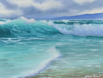
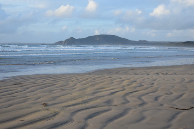
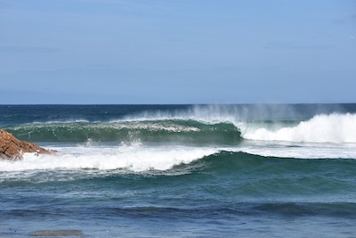
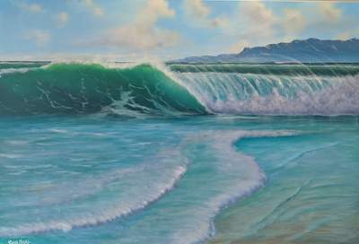
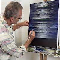
If you have works in progress you would love to show off, or finished pieces you are particularly proud of, we would love to see them! We especially like to hear about the story behind the creation. This month's submission comes from Tasmanian artist Steve Myers with the journey of this large commission painting. From Steve: "Hi everyone I’m Steve from Tasmania, Australia. I live and work in Launceston, but I travel to many of Tasmania’s beautiful beaches on the weekends. I love to surf and paint the rugged West coast of Tasmania. It is a place I go for peace and connection. I really feel humbled by the power and beauty of this coastline. You can really be alone here. My background profession is in the medical sciences where I teach undergraduate science. I started painting about five years ago, later in life. I would have to say that Mark was a big influence on me and seeing his work gave me the inspiration to paint. I usually collect a lot of photo reference material and try to capture some of the drama of the sea with a quick sketch. A friend of mine liked one of my paintings and wanted me to paint a larger picture. This painting is of Marrawah on the West coast of Tasmania, Australia. The background headland is Preminghana and is of
great significance to the Tasmanian Aboriginal community as it contains the most significant petroglyphs (huge rock engravings) in the world
(Tasmanian Aboriginal Centre Incorporated. Preminghana, Healthy Country Plan 2015; https://tacinc.com.au/programs/land-management/).
I made the larger painting from predominately two reference photos. The headland was taken from a photo of Preminghana and the wave from another region of the west coast called West Point Reserve.
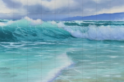
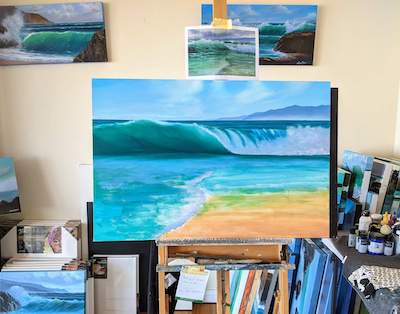
My Photos: Steve Myers. Please feel free to use them. So, I set out to paint a larger version of this painting 90 cm x 60 cm. I had never painted this big before and ran into many problems 😊. The first issue was how to take a small painting (40 cm x 30 cm) and enlarge it, so it kept the same dimensions. I tried to just copy it freehand to a larger canvas. Big mistake, my eye is not as good as Mark’s, and I had a painting that was out of perspective. So, I tried the grid method. I divided the canvas into squares and transferred the grid to the larger canvas. This helped me keep the painting in proportion.
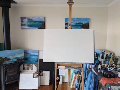
Finally, I was ready to start. Once I had the canvas on the easel, I stared at it for a long time. I realised I needed bigger brushes. My small brushes would take forever to cover a big canvas. Off to Bunnings to buy some bigger brushes. I must admit that it was daunting putting out so much paint on my palette. But I did, and believe me, I needed it all and more 😊.
So, I made a start and got to the block in stage in oils. I used Mark’s recipe book for the colours and a few of my own. For the sky, I used French Ultramarine Blue, a tiny spec of Pthalo Blue, and Titanium White for the highest part of the sky, and added French Ultramarine Blue and Titanium White for the lower part of the sky, and then added Titanium White to that mixture for the horizon. For the clouds, I just used Titanium White and created small wispy clouds that I blended wet-into-wet. I didn’t want too much happening in the sky to detract from the wave which was the main focal point of interest. The headland was French Ultramarine Blue, a tiny bit of Burnt Sienna to desaturate the blue, and Titanium White. In the distant headlands, I added the sky colour to push them back. The sea mist below the first headland was created by adding a thin line of Titanium White and sky colour, and blending it upward into the base of the headland. The back ocean colour was a mixture of French Ultramarine Blue, a tiny spec of Pthalo Blue, and Yellow Ochre to give the sea a greenish hue. For the top of the wave, I used Cadmium Yellow Light, Pthalo Blue and Titanium White. For the deeper part of the wave, I used Sapphire and Burnt Sienna to get the bottle green colour. The white water was a mixture of French Ultramarine Blue, Burnt Sienna and Titanium White for the shadow colour, and I blended Titanium White into this for the lighter-coloured foam. For the sand, I didn’t know what I was doing yet, so just scrubbed in yellow ochre and titanium white 😊
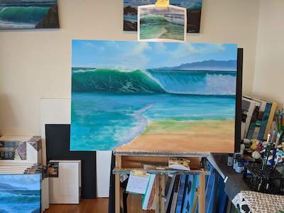
Next, I started the foam trails with much hesitation. This I find very difficult and since I completed this painting, I feel they are slowly getting better. The foam trails are a mixture of Ultramarine Blue and Titanium White, with a little Burnt Sienna. I still didn’t know what to do with the sand region yet. I find painting is a puzzle and it is good to leave it for a while and go back to it with fresh eyes.
In the final painting, I was happy. I added more light to the clouds with a mixture of Titanium White and a tiny bit of Burnt Sienna. I used that same mix to create the terrain on the headlands, adding sky colour to the Titanium White-Burnt Sienna mix as I moved away from the headings to the furthest headlands. I added the Titanium White-Burnt Sienna mix to the lip of the wave and the spray back. I also added another approaching wave to give the painting the feel of a set of waves approaching. I also darkened the shadows in the foam with Ultramarine Blue, Burnt Sienna and Titanium White. I decided to paint over the sand to give the feeling of shallow water. This was a series of glazes with Sapphire and a tiny bit of Pthalo Green. I added some transparent ripples and angled white water to give the feeling that there was a large rock, perhaps at the bottom left pushing the water in a different direction.
Since this painting, I have been practising my foam trails and sea colours. The sea colour is very different here on the west coast of Tasmania and has a distinct turquoise colour. This painting I did is of the same area, but I wanted to capture that feeling of remoteness and wildness.
We hope you enjoyed this issue of Acrylics Anonymous! If you have any suggestions, comments or feedback for the ezine or our site, please don't hesitate to contact us. Until next time, make sure you stay safe and well, and don't forget to chuck some paint around! Cheers from Frankie & Mark :) For our Youtube channel, click here. To join our Youtube channel as a member for a few bucks every month (in exchange for even MORE awesome perks, click here. For our Instagram, click here. For our Website, click here. For our Facebook page, click here. For our Pinterest, click here. For our Tik Tok, click here. |
| Back to Back Issues Page |