- Home
- Painting Tutorials
- How to Paint Fabric

Learn How To Paint Fabric With Fabulous Folds And Nuanced Shadows.
Break down the appearance of fabric, and rebuild it with simple straightforward painting techniques.

Gradations of colour and tone pretty much occur everywhere. When learning how to paint fabric, gradation skills and observation skills are very important.
Some gradations are quite obvious, and some are subtle. Even within the most subtle gradation of colour, there is a whole world of nuance. They are rarely just gradations in tone. There is usually a shift in hue as well. And often, several.
Throughout history, artists have been mesmerised by the illusion of dimension, particularly in figures and fabric. Being able to “gradate” colour and/or tone is necessary for this.
You may not wish to paint fabric “realistically”, but knowing the process and the “rules” around this process will allow you to expand your creativity.

By this I mean you will start to discover colour and nuance where before you may not have, leaving you with the wonderful opportunity to either exaggerate, or even abstract. Knowledge is freedom.
So let’s look at fabric.
When learning how to paint fabric, it’s useful to simplify. For this purpose, we’ll look at some plain white-ish fabric. If you throw it on the table, and start looking closely, you’ll start to notice several things. Not only are there highlights and shadows, there are also often reflections of highlights, reflections of light from other objects in the room, and even sometimes reflections of shadows, and in shadows. One of the best places to look for these is in the areas that are not highlit.
The old masters used to (for a period anyway) hide all their brush marks, and used a complicated process of glazing, layering and soft brushes to remove any hint of brushwork. Those gradations are sublime. Are they necessary? That’s up to you, and your work. BUT. Seeing them, and being able to paint them reasonably well, expands your capabilities.
So let’s learn how to paint fabric!
What You Need:
Atelier Interactive Artists Acrylics:
- Titanium White
- Burnt Umber
- Cadmium Yellow Medium
- Dioxazine Purple
- Permanent Alizarine
- French Ultramarine Blue
Atelier Unlocking Fluid
I use Artists quality acrylic paints by Chroma Australia, Atelier Interactive and Atelier Free Flow.
Fine mist spray bottle
Canvas - 30cm x 40cm approx
Brushes:
I use cheap flats (if they’re new, beat them up a bit first to get rid of the stray hairs). You’ll need one approximately 5mm across, 1cm across, and 2cm across - or size 4, 8 & 12 approximately (why don’t paintbrush companies talk to each other and make them all the same sizes?)
2 round soft brushes for blending, approximately a size 4 and a size 10.
Here we go!

The first step is to get all of the large areas of colour down.
Using wet-in-wet technique, we’ll block in all the large areas of colour, and then “roughly” smooth the surfaces with a large soft brush.
Start with your shadow areas. Mix Burnt Umber and French Ultramarine Blue, Titanium White with a touch of Cadmium Yellow Medium, and block in the shadows.
You need to look at your image in a “layered” way. In other words, separate the shadows from the mid-tones and the highlights. Sometimes this process requires more than 3 “colours” - don’t be scared of breaking the layers into 3 or 5 or even more increments.
Mix up your mid-tones using a mix of the above colours plus Titanium White, with a touch more Burnt Umber and Cadmium Yellow Medium. Then blend this colour into the shadows, using a cross-hatch technique, and then softening with a feather touch and a soft dry brush.
TIP: As the paint dries, you can add TINY amounts of water to your brush to aid the blending process.
Too much and you’ll make a “hole” in your paint.
Starting with a giant pile of White, we now mix up our highlight colour, adding a tiny amount of the above mix (so this colour is almost pure White).

We paint this highlight colour (remembering that we’re still only blocking in) in the appropriate places and using the same process as above to roughly soften and blend.
The next stage is pretty much a repeat of the above. This time we take much more care with the blending of each area of the fabric. You should have a lovely smooth transition from light to darker.
If you’re using Atelier Interactive, and you find that the paint has begun to dry and won’t blend smoothly, don’t panic! Grab your Unlocking Fluid (in a fine mist spray bottle) and mist the fluid over the areas in your painting that are becoming sticky. (Gotta love a product that makes things easier).
Now go back to your previously draped fabric. LOOK VERY CLOSELY. See if you can see if there is light being reflected from anywhere. You can often see it on the edge of a fold - it may be a blueish colour from light entering from outside, or it may be a gold from the light bouncing off the highlights on the fabric.

Adding these highlights to your painting is a relatively simple exercise, and adds realism and nuance to your fabric painting.
Get a soft, dry brush, and load it with the appropriate “reflection” colour, and very subtly apply it. The brush needs to be very dry, and your touch, very soft. It is better to build this colour in subtle increments. This will prevent you from overdoing it in a way that makes it difficult to recover.
You should now have a lovely smooth transition in your fabric with some subtle nuance.
More interest, more colour, more depth. EVERY time you pick up a brush, you improve.

Let’s have even more fun painting fabric!
Paint a canvas entirely with a bright pink, turquoise, or any other luminous colour that takes your fancy.
(There are a whole heap of theories about which colour you should use as a ground. For some more ideas on painting impressionistically, click here).
Using the same colour mixes as the previous exercise, loosely block in the shadows, leaving flecks of the ground showing through.
Grab the mid-tone colour, and loosely apply in the same way, roughly blending the colours together, leaving the ground to show through here and there.
Repeat this process for the highlights. Done and done.

This loose approach creates a little bit of movement and colour, and requires a little less “finesse” and “finishing”. Great fun. AND fast. Uses less paint too. Winning!
This is the beginning of the process of learning how to paint fabric. Once you feel comfortable with this, start investigating how to paint fabric with patterns and different sheen levels and colours.
Challenging, but so so rewarding!

Search This Site:
WTH is Acrylics Anonymous?
For more great painting tips, subscriber only specials and zingin' humour (hmmm, maybe?), subscribe to our monthly e-zine, Acrylics Anonymous. It’s fast, free, and we don’t send you junk. As a valued subscriber, you can purchase our 3 pack of downloadable how to paint with Mark Waller DVDs for only $80, or our downloadable V-log “Coral Reef - Underneath” for only $12.
See your subscription confirmation email for more details.
Subscribe here:
Recent Articles
-
Storm Coming
Mar 25, 24 09:41 PM
 I repainted over an old canvas. This painting just painted itself in under an hour. I didn't even have a fixed reference in mind - it just seemed to flow.
 -
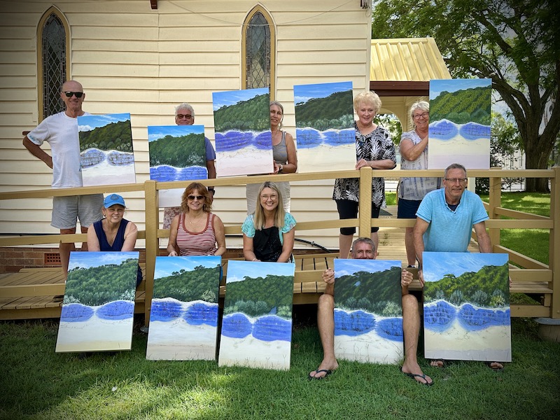
Upcoming Workshops with Mark Waller
Mar 05, 24 11:09 PM
 Upcoming workshops & tutorials in your local areas, check here!
 -
Workshops past. Been & gone. Delve into past notes, info and stories.
Feb 26, 24 09:42 PM
 Mark Waller's workshops past - discover what was learned about, talked about, laughed about and consumed with gusto!
 Subscribe to this site!


)
![]()
About Us | Contact Us | Sitemap | Disclaimer | Privacy
Our Partners:
Copyright© 2007- All Rights Reserved
New! Comments
Have your say about what you just read! Leave me a comment in the box below.